Riversport
Industry: Sports & Entertainment
Services: Brand Positioning, Naming, Logo Design, Identity System, Brand Standards, Creative Services, Website Design
The client’s objectives:
- Align a new brand identity with the client’s vision and marketing strategy
- Reflect its stature as a newly-named US Olympic & Paralympic Training Site
Logo


Color Palette
Primary colors in the system are blue, medium blue and grey. Blues and grey are the colors that were later designated for Olympic Training Facility collateral. A secondary color palette can be used to organize the system such as orange for rowing and green for canoe and kayak.
– M. Elizabeth Laurent
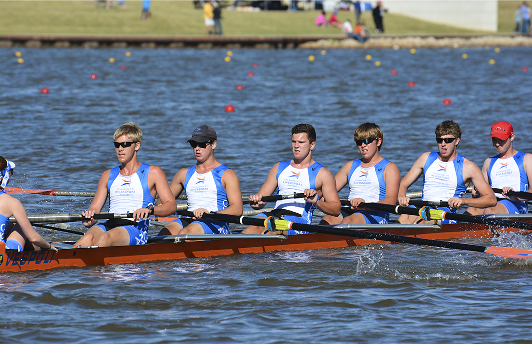
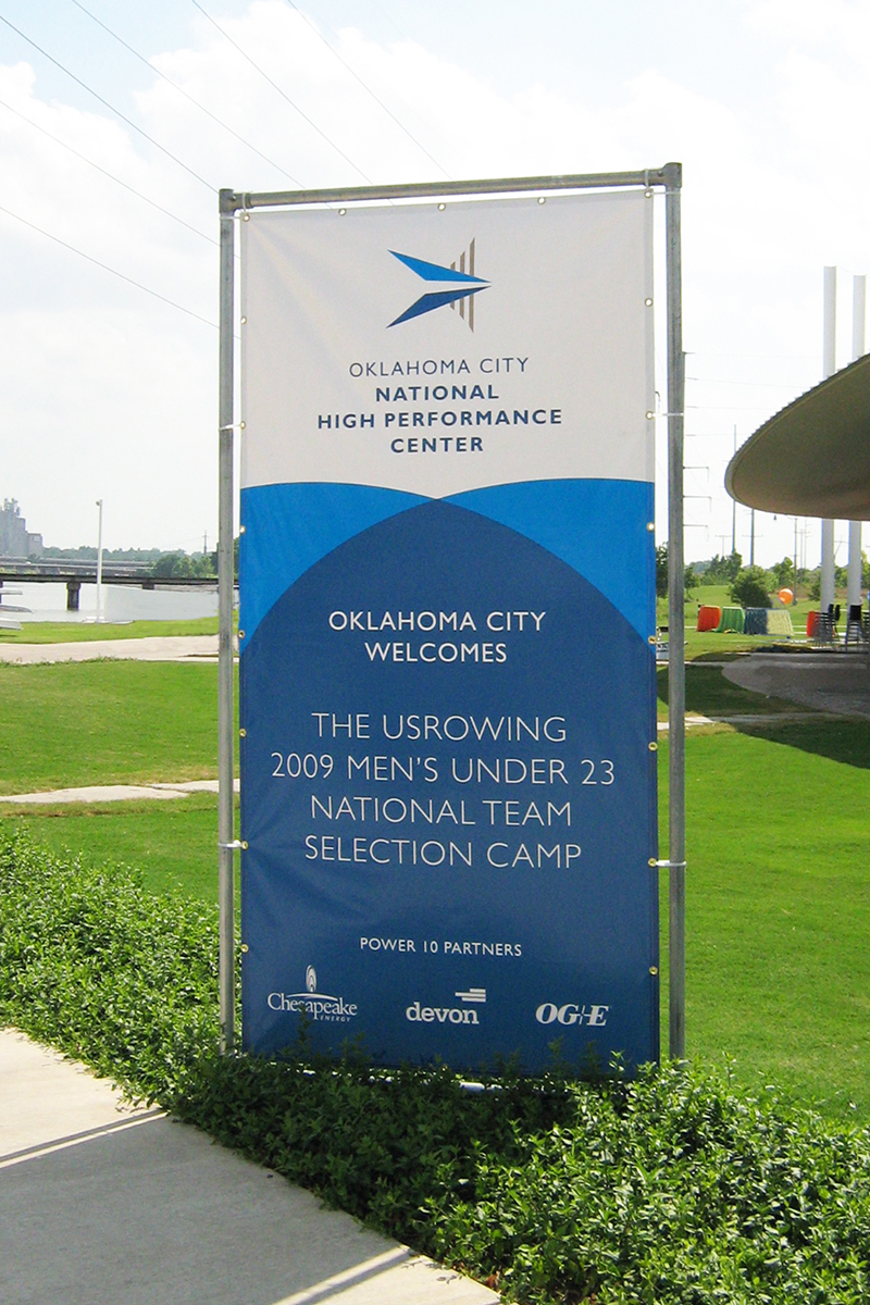
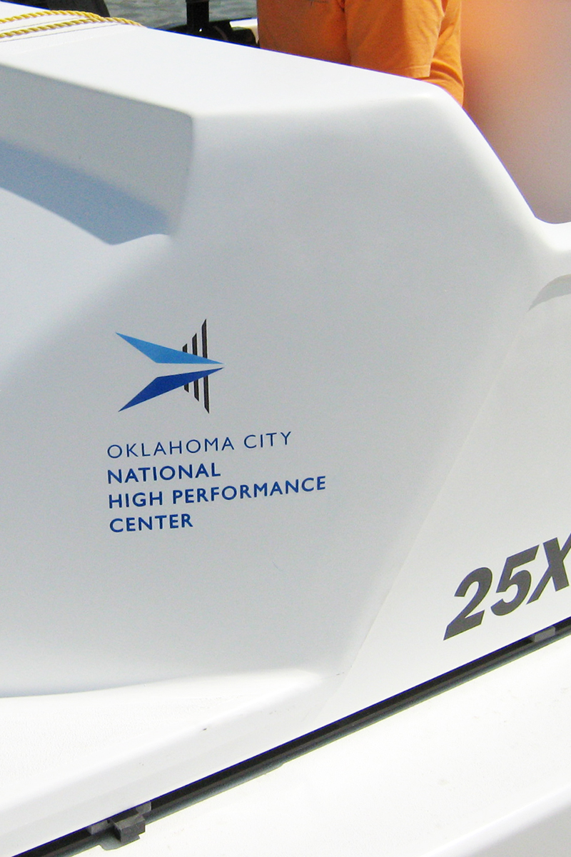
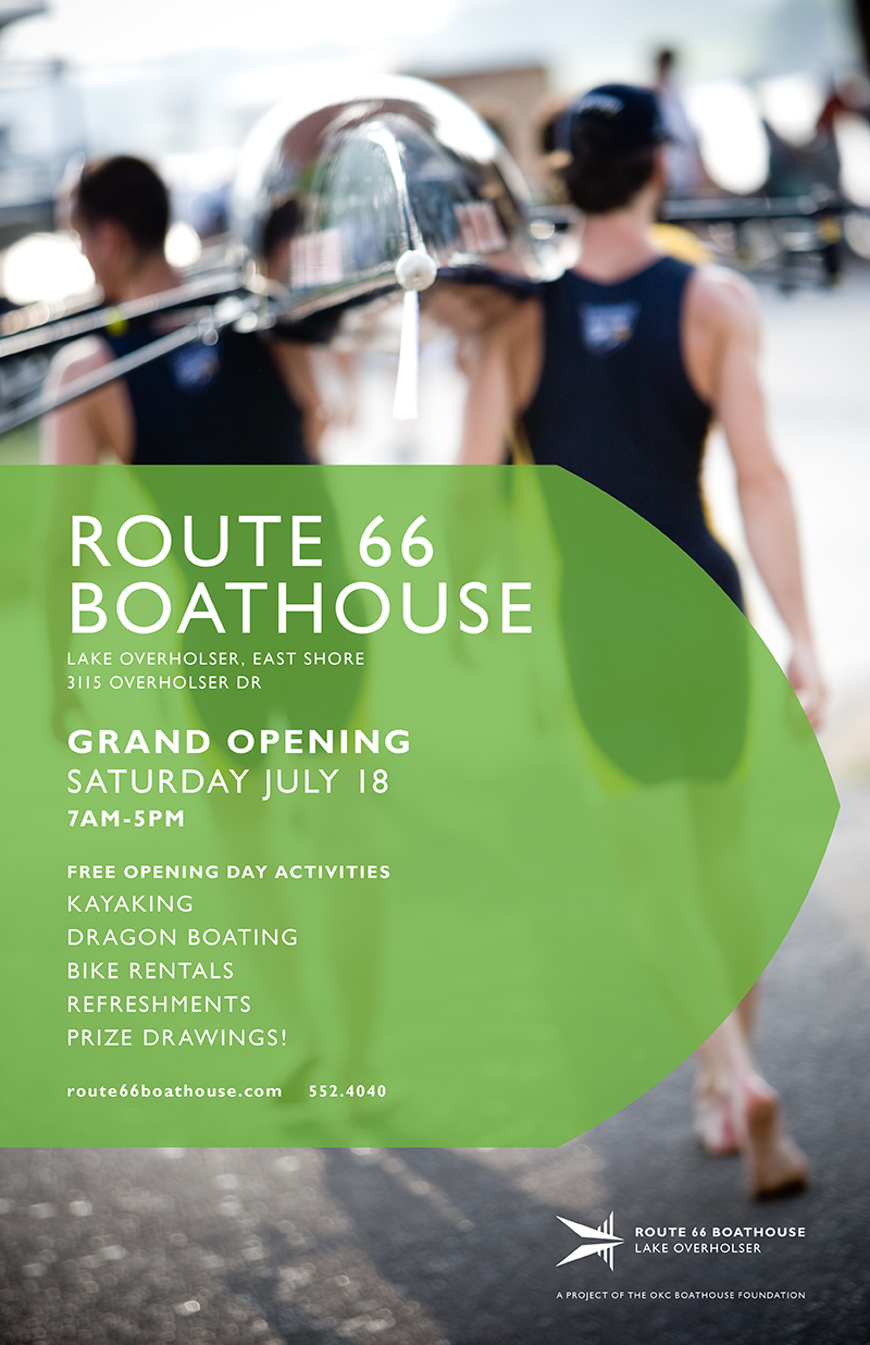
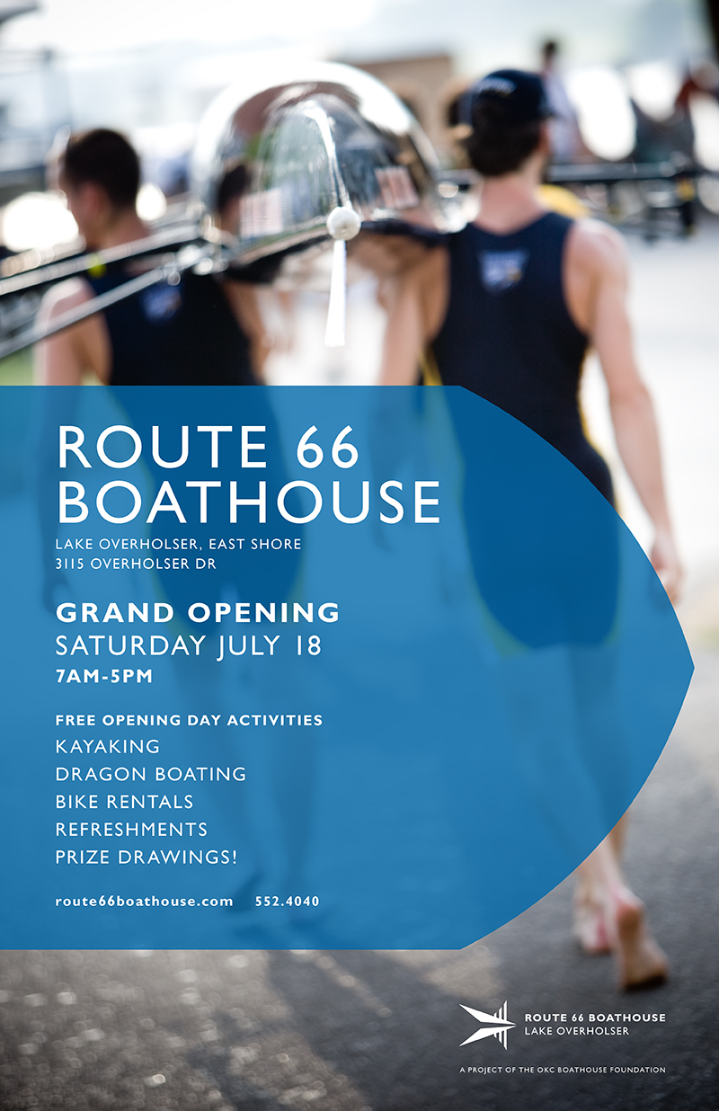

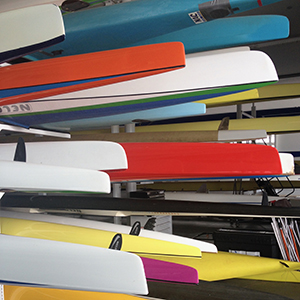
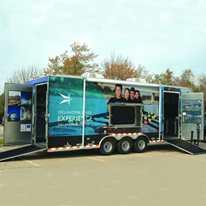
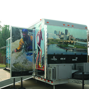
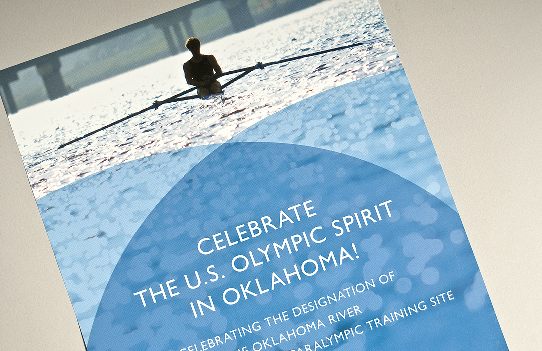
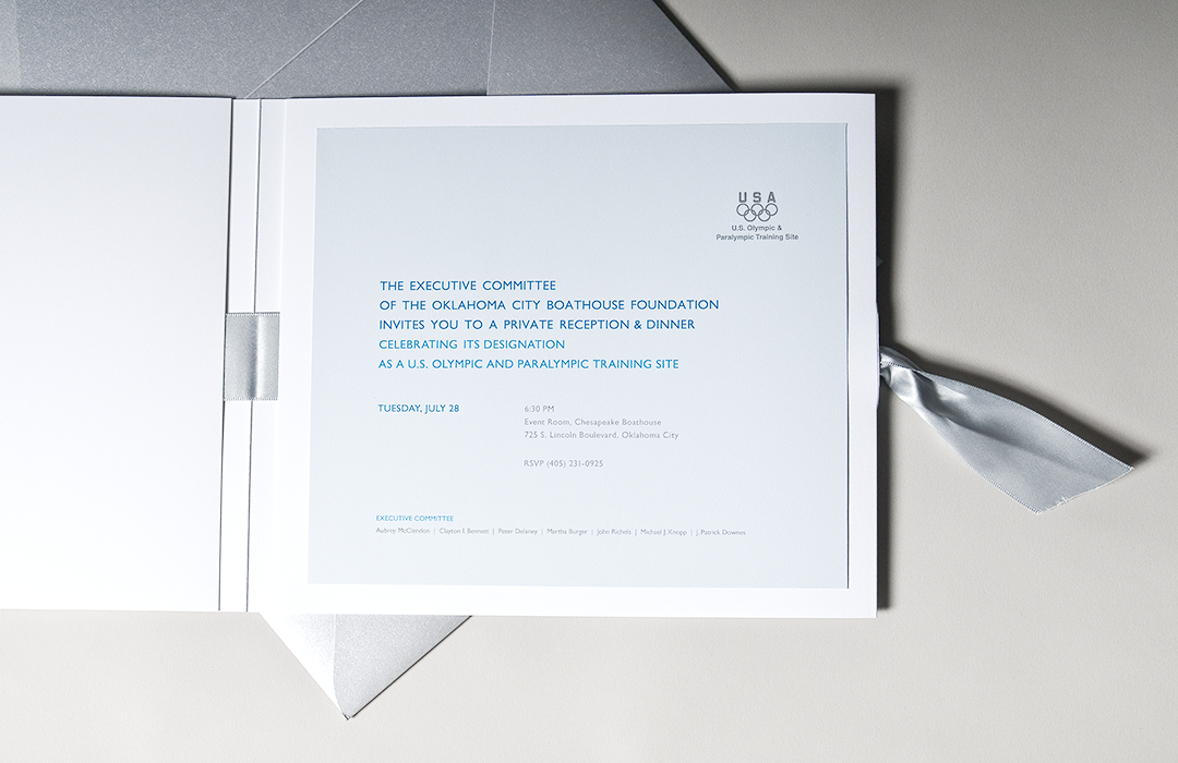
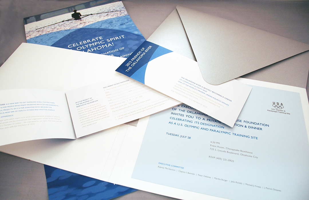
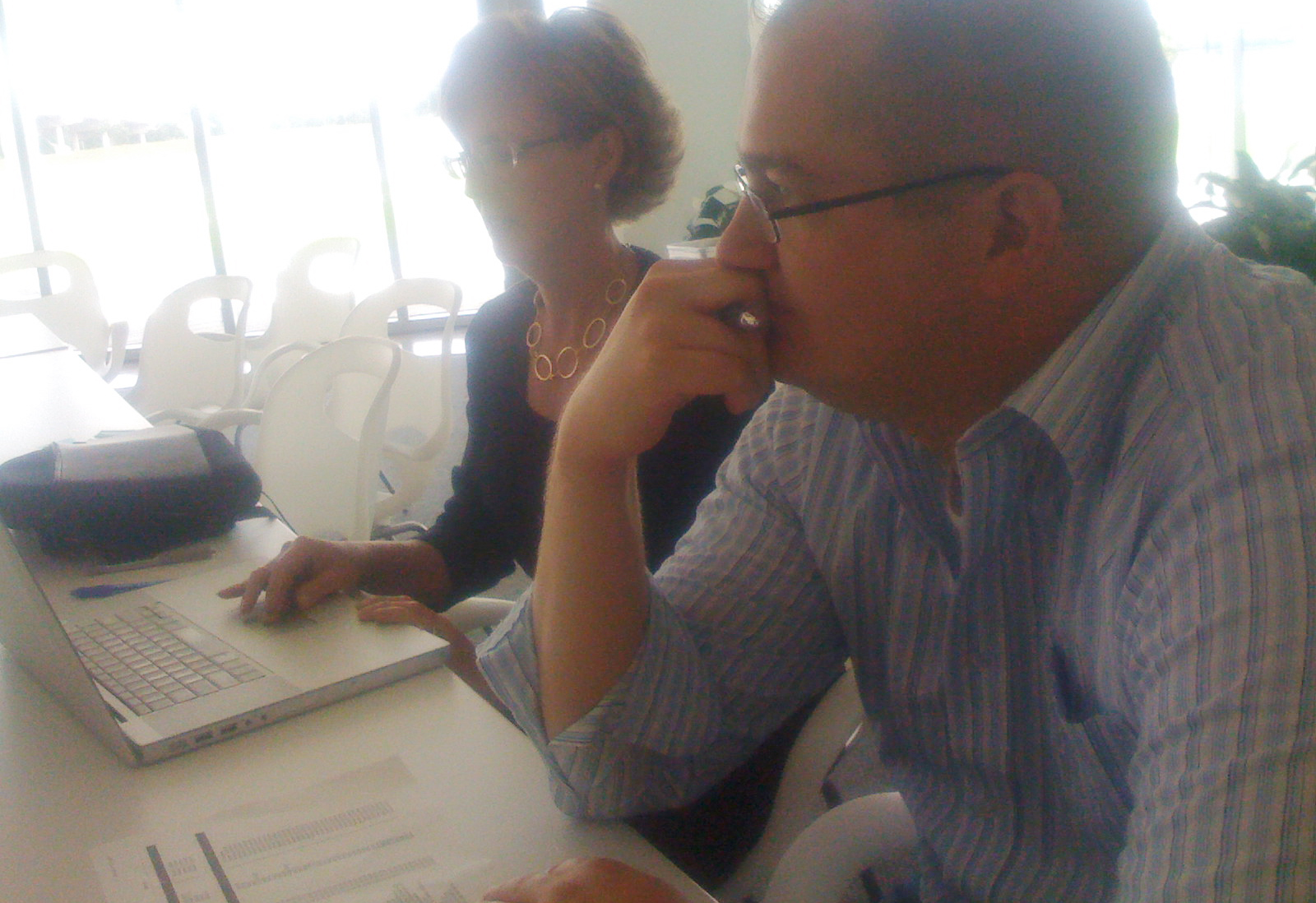
brand rollout implementation
M. Elizabeth Laurent designed the comprehensive marketing and brand strategy. This strategy bridged Mike Knopp’s vision for the river and the development with the creative foundation underlying the project and the new identity. From the name RIVERSPORT, to ensuring the brand’s adaptability and longevity across all sectors of the business, Elizabeth’s clarity and leadership was essential to the success of the project. And, she is a joy to work with!
– M. Elizabeth Laurent
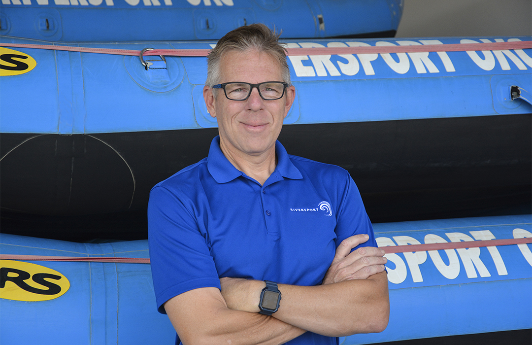
Founder’s Story
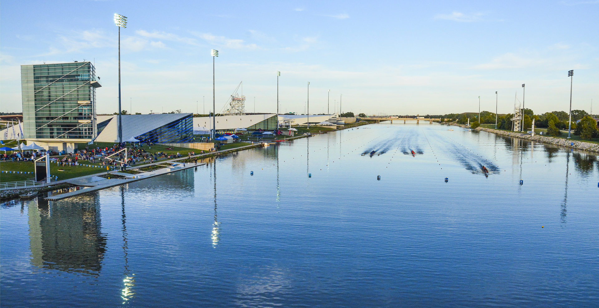
A passion for rowing and paddling, and a vision for bringing national and international sports to the Oklahoma River have been the driving force behind Mike Knopp’s leadership in developing the Oklahoma City rowing and paddling community, the Boathouse District, national and international sporting events, and ultimately, the master plan development of the Oklahoma River. Originally a practicing attorney, Mike left his legal career in 2003 to establish the Oklahoma City University varsity rowing program and assume the position of executive director of the then Oklahoma City Boathouse Foundation – now the RIVERSPORT Foundation.
Results
- a world-class brand that reflects the client’s stature as a US Olympic and Paralympic Training Site
- a brand representative of the emerging role as one of the top rowing and canoe/kayak venues in the world
- a brand that reflects the contemporary architecture and vision behind the Boathouse District
- a brand that represents their commitment to taking these sports in innovative new directions
Special thanks to Riversport Foundation and Georgia Read, photographer for contributing beautiful photography to this case study.
View other case studies
McCubbin
making a lasting impression
Embark
transportation for all
