Plico – project
PLICO supports and protects healthcare professionals and entities through a variety of products and services, most notably as a provider of medical professional liability insurance. With the company evolving from a physician-only provider, introducing new products and expanding into the Midwest region, PLICO needed to update its branding to best reflect the company they were then and would be in the future.
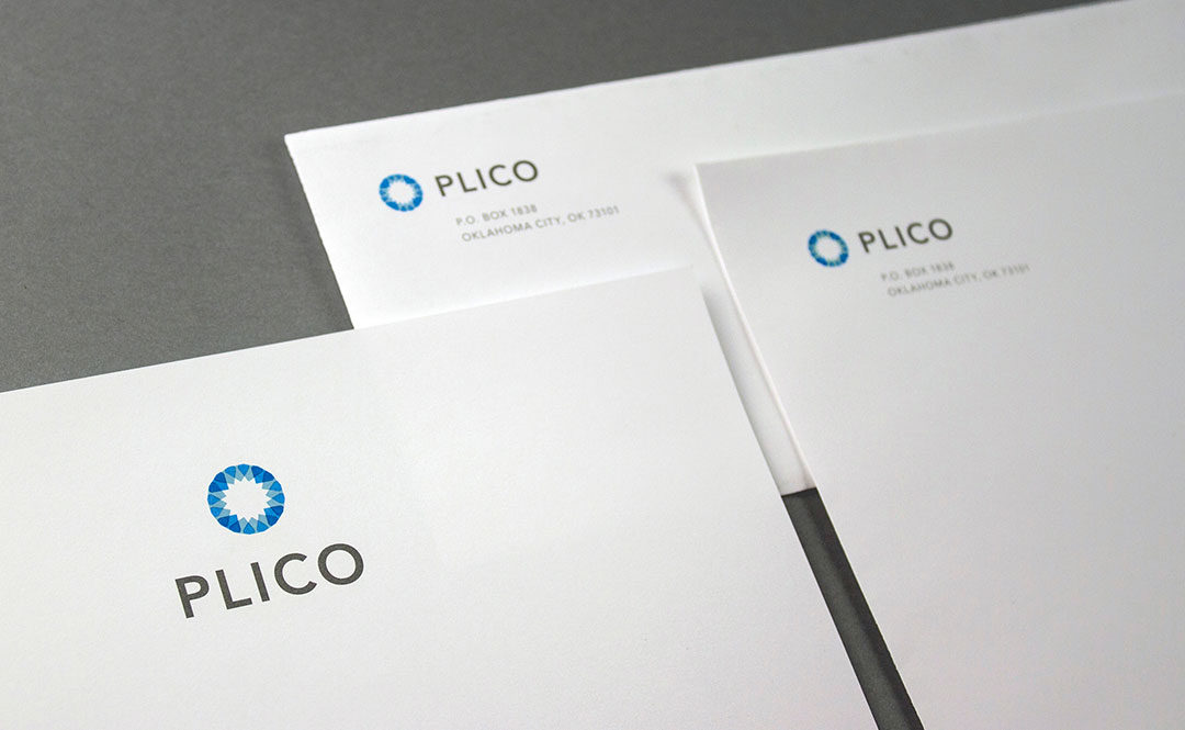
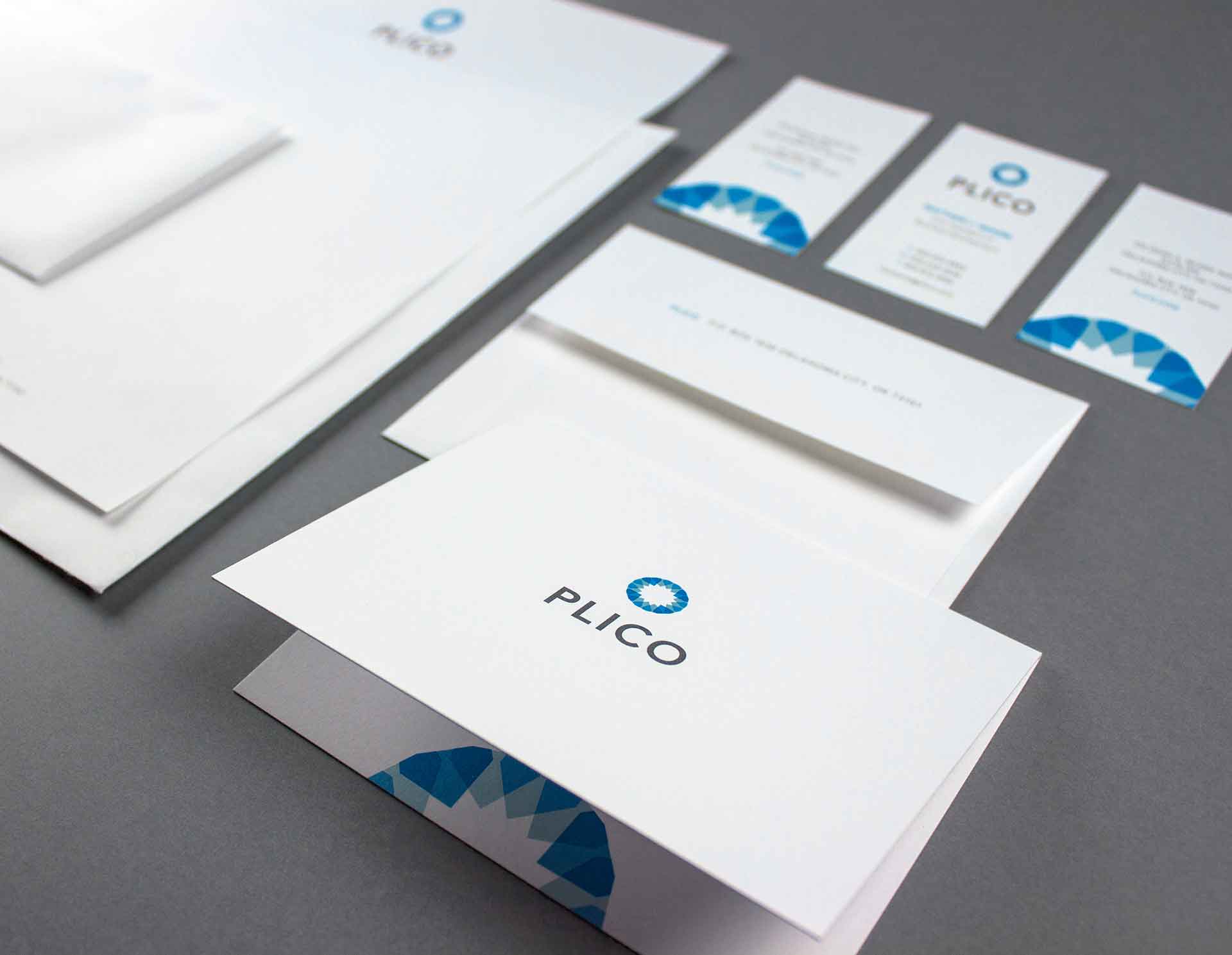
Therefore, we created a new logo with a clean, classic and professional aesthetic that still feels friendly and approachable. We chose blue because it evokes care and trust and also ties back to the history of the company. Multiple, strong shapes came together to form one mark, which represent the relationships PLICO cultivates with insureds. A star formed in the middle indicates PLICO is a guide to navigating risk management and liability claims. Finally, a subtle cross is found in the mark, which represents the medical field.
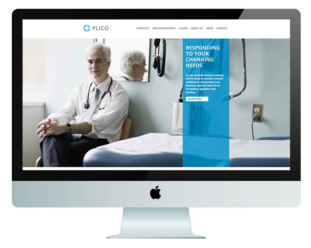
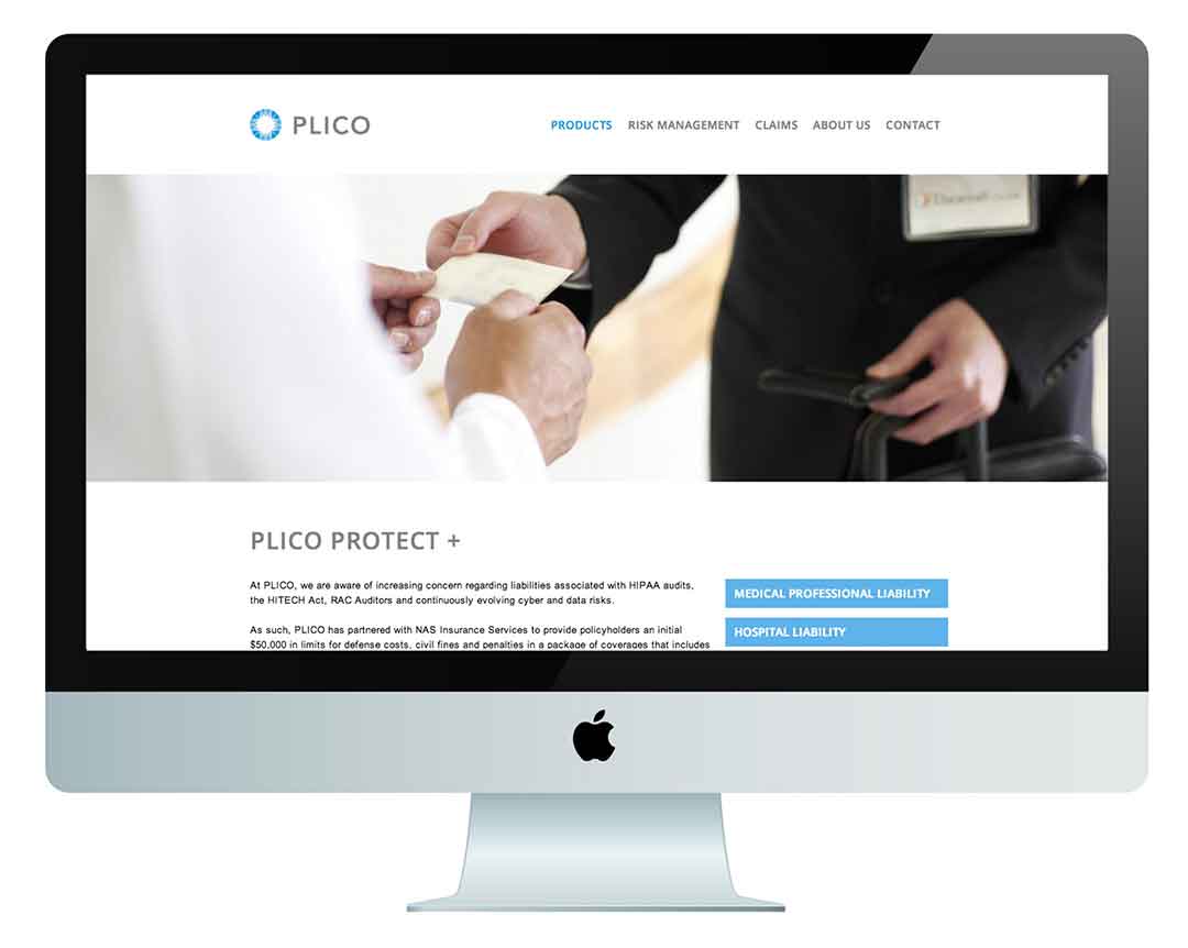
PLICO’s new marketing materials contain a high-end, business casual aesthetic with a contemporary secondary color palette to appeal to the next generation of physicians. These materials contributed to PLICO’s success and helped them achieve a 30% gain in market share. Furthermore, the new branding positioned the mid size company for a successful acquisition by a global organization.
Logo Simplification


“Testimonial text on colored background lorem ipsum dolor sit amet, consectetur adipiscing elit.”
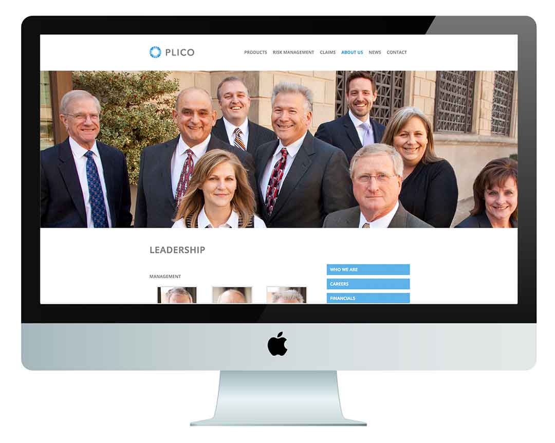
Website

Results
Lorem ipsum…
