a foundation for a movement
Red Coyote
Industry: Retail, Running
Services: Brand Positioning, Naming Consultation, Logo Design, Brand Consulting
Red Coyote is central Oklahoma’s “go to” running store for fitness-minded people. The store offers a custom fitting process which analyzes the individual’s stride and product needs. Then, they educate the customer on the best use of the product to guarantee a positive result. When opening their new store, co-owners Burke and Jon Beck were looking for a memorable brand identity design to differentiate them in a crowded market space. The new logo would need to work with the contemporary architecture in Classen Curve, an innovative and upscale shopping destination. The brand name was inspired by the Beck family’s dog and store mascot, Pancho, who loves to run.
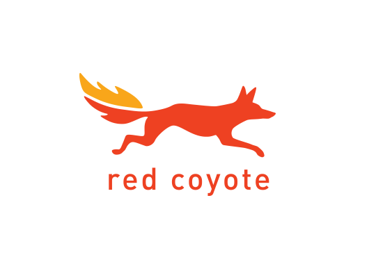
While creating a mark for Red Coyote, we visualized Pancho running so fast he was literally on fire. The motion in the design illustrates the sport of running, as well as Red Coyote’s slow motion video gait analysis service. The typeface DIN dates back to the early 20th Century and is known for its suburb legibility, functionality and utilitarian form. The colors are energetic and sporty. The Red Coyote brand is easily recognizable on store signage, wearables and other promotional materials.
This quirky coyote logo is approachable and appeals to both experienced runners and the community at large. It’s common to see customers identify as part of the pack.
ADDY® Award Winner for Logo Design